Theme Designer
Configure global colors, Google Fonts typography, border radius, spacing, and shadows for your site.
The Theme Designer provides a central design system dashboard where you can build and apply cohesive visual themes across every page, block, and button on your website in one place.
Overview
To open the designer, select the Theme tab in the left sidebar of your Site Management page.
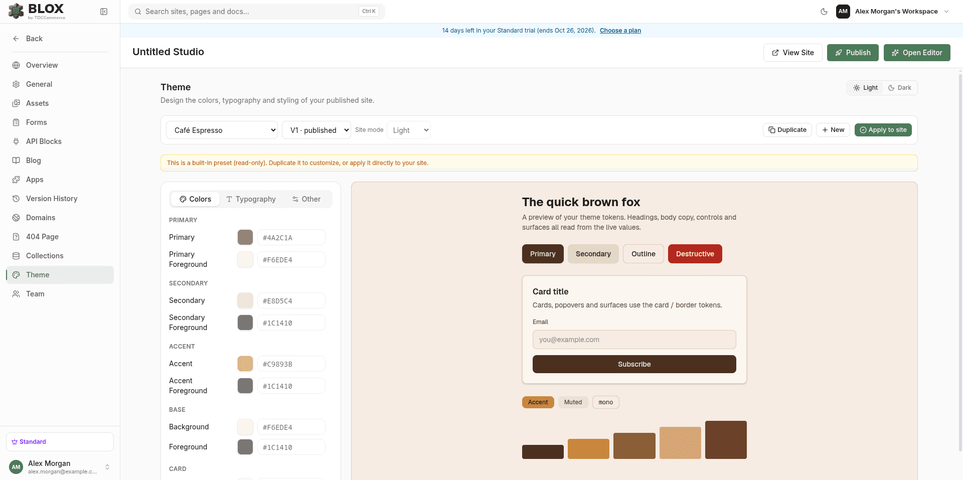
The interface consists of a Theme Control Panel on the left, which is divided into three configuration tabs: Colors, Typography, and Other. The right side of the screen renders an Interactive Live Preview of standard components — headings, paragraphs, Primary/Secondary/Outline/Destructive buttons, a sample card, accent/muted chip badges, and a five-swatch chart-color strip — styled with your active design tokens.
The Theme tab isn't gated by any plan tier — custom themes and Google Fonts browsing are available on every plan. It only requires the Manage Settings permission on the site.
Designer Controls & Navigation
1. Theme Selection & Presets
- System Presets (Read-Only): Blox includes built-in design presets (e.g., Slate, Emerald, Classic). Presets are read-only. To customize them, click the Duplicate button to clone the preset into an editable custom theme.
- Your Themes: Click New to start a custom theme from scratch. You can delete custom themes using the trash button.
- Version Selector: Switch between your Draft version (where edits occur) and past Published versions (e.g.
v1,v2) to roll back styles.
2. Light & Dark Mode
- Light/Dark Mode Editing: Toggle between Light and Dark in the header. Colors are configured independently for each mode; typography and the Other-tab sliders are shared between both.
- Site opens in: Choose the mode visitors first see from the Site opens in dropdown next to the Light/Dark toggle. Save and publish the theme to apply it. Presets are read-only, so duplicate one to change it.
Light: The site opens in light mode.Dark: The site opens in dark mode.System: The site follows the visitor's device setting (prefers-color-scheme).
- How visitors see it: Visitors switch the whole site between Light and Dark with the theme toggle in the header. If you turn on Floating light/dark button in General Settings, a small round toggle appears in the bottom-right corner whenever the header has no visible toggle. The choice lasts for the rest of the visit, and a new visit opens in the Site opens in mode again.
- Sections follow the mode: Preset sections use your theme's colors, so every section switches together. A section background set to a near-black or near-white color follows the mode too; brand colors, photos, gradients and animated backgrounds keep their look in both modes.
Customizing Styling Tokens
Select from the sidebar tabs to customize your site's style rules:
Color tokens are set independently for Light and Dark mode, grouped into:
- Primary, Secondary, and Accent — your brand colors, each with a matching foreground (text-on-color) token.
- Base, Card, Popover, and Muted — background surfaces at different elevations, each with its own foreground token.
- Border & Input — border, input outline, and focus ring colors.
- Destructive — the color (and foreground) used for delete/remove actions and error states.
- Charts — five colors (Chart 1–5) for data visualizations.
- Sidebar — a dedicated set of eight tokens (background, foreground, primary, accent, border, ring, and their pairs) for sidebar-style navigation UI, separate from the rest of the palette.
Set typography for three font roles — Sans-Serif Font, Serif Font, and Monospace Font — shared between Light and Dark modes:
- Preset Stacks: Pick a named stack from a dropdown — options include Inter, System UI, Geist, Roboto, Open Sans, Poppins, Montserrat, Lato, DM Sans, Georgia, Merriweather, Playfair Display, JetBrains Mono, Fira Code, and Menlo.
- Google Fonts: Click Browse Google Fonts under any font role to search the full Google Fonts library in real time, filterable by category (All, Sans-serif, Serif, Display, Handwriting, Monospace). Selecting a font automatically links its stylesheet and renders it on the live preview immediately.
Fine-tune sizing and effects, shared between Light and Dark modes:
- Radius:
0rem(sharp edges) to2rem(rounded pill buttons and cards). - Spacing:
0.1remto0.4rem, scaling internal padding and gaps. - Letter Spacing:
-0.1emto0.1emof character tracking. - Box Shadow: a color/opacity picker, Blur and Spread radius sliders, and Offset X / Offset Y sliders.
Saving & Deploying Themes
Edits to custom themes are saved as drafts to prevent disrupting your live website:
- Save Draft: While editing, click Save draft in the toolbar to save your progress.
- Apply to Site: If you are switching to a built-in read-only preset, select the preset and click Apply to site in the toolbar to set it active.
- Publish: For custom themes, click Publish in the toolbar. This creates a new immutable version snapshot (
V1,V2, …) — the same versioning pattern used for pages and layouts — applies it to your site, and deploys it to your live web domain. You'll see a "PublishedV{n}and applied to site" confirmation.
See Version History for how TDC's other version-snapshot systems (pages, header & footer) work — theme publishing follows the same draft → version → deploy model.
Related
- General Settings — Site-wide branding, favicon, and SEO settings that sit alongside your theme.
- Editor Overview — See your published theme tokens applied live across the visual editor's canvas.
- Version History — The same draft/version/publish model used for pages and the site layout.