Blocks
Every block type available in the editor — what it does and how to configure it.
Blocks are the individual design and content elements nested inside sections. You can add, reorder, and customize blocks to build your page contents.
Adding a Block
You can add blocks in two ways:
- From the Sidebar: Open the Blocks tab in the Left Sidebar and click any block to add it to the active/focused column or section.
- From the Layers Panel: Click the + (plus) icon next to any section layer to open the block library and insert it directly into that layer.
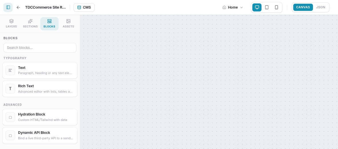
Block Categories & Types
Typography
Text
Used for short lines of copy, subtitles, or standalone paragraphs.
- Settings: Font size, weight, and style (Normal, Italic, Oblique); text color; alignment (left, center, right, justify); an HTML tag override (p, h1–h6, span, div) for semantic/SEO control; line height; and letter spacing.
Rich Text
A full WYSIWYG text editor for long-form content.
- Features: Headings H1–H4, bold, italic, underline, strikethrough, bulleted/numbered/task lists, blockquotes, inline and block code, hyperlinks, resizable images, YouTube embeds, tables, and inline font-family/size overrides. A raw HTML/Liquid block is also available for advanced embeds.
Media
Image
Renders visual image files on your webpage.
- Settings: Upload a file from your assets or input a URL, specify descriptive Alt Text for SEO/accessibility, define dimensions (width/height), select object fit (Cover, Contain, Fill, None, Scale Down), apply rounded corners, set opacity and a border, choose a hover effect (Lift + Shadow, Shadow, Scale Up, Glow), and set a click action link.
Video
Embeds a video from an uploaded asset or a YouTube URL.
- Settings: Source (asset or YouTube URL), autoplay toggle, loop toggle, player controls visibility toggle, and a mute toggle (required by web browsers to allow autoplay).
Carousel
An interactive slideshow displaying multiple image slides.
- Settings: Add, remove, and reorder slides (each with an image, heading, and description), adjust the autoplay interval, toggle navigation (arrows and dot selectors), and choose a transition — Slide or Fade.
Card
A content card combining an image, header, description, and button.
- Settings: Card background color, border radius, padding, a hover effect (None, Lift Up, Soft Glow, Zoom Image), a fine-tuned shadow (offset, blur, color), card image source, title, body description, and CTA button destination.
Card Carousel
A horizontally scrolling viewport displaying a list of Card-style slides. Excellent for showcasing product features, reviews, or team bios.
- Settings: Add, remove, and reorder items (each with an image, title, description, and button), the number of cards shown at once (1–4), card/image dimensions, gap, autoplay interval, and arrow/dot navigation.
Documents
Displays a listing of downloadable assets or PDFs associated with your site.
- Settings: Document selection, a button label and destination, and layout options — number of columns (1–4), gap, and colors for the card, border, icon, and button.
Advanced / Coding
Hydration Block
A developer-focused block for embedding raw HTML markup styled with Tailwind CSS utility classes.
-
Settings: An HTML template editor. Use
{{global.key}}to inject a global variable, or{{collection.slug.index.field}}to pull one specific item out of a collection. To loop over an entire collection, use{{#each collection.slug}}...{{currentItem.field}}...{{/each}}, for example:{{#each collection.products}} <p>{{currentItem.name}} — {{currentItem.price}}</p> {{/each}}This is a lightweight, Handlebars-like template syntax — it is not Liquid.
-
This block only exposes margin/padding spacing controls — it has no border, shadow, animation, or device-visibility settings.
Dynamic API Block
A block that calls one of your configured API definitions and renders the response.
-
Settings: Pick an existing API definition from the dropdown. Request mapping and the output template are configured in the linked Block Studio editor, which genuinely uses LiquidJS syntax —
{{ data.field }}to print a value, or a loop for arrays, for example:{% for item in data.products %} {{ item.title }} {% endfor %}
Actions & Forms
Button
A styled call-to-action button.
- Settings: Label text, a destination URL (a plain text field — paste an internal path or an external address), open-in-new-tab switch, a width value (
auto, a percentage, or a fixed pixel size), border rounding, hover states (background/text color, scale), and an optional leading or trailing icon.
Search
A search box that takes visitors straight to what they searched for. The matching pages, blog posts and CMS items appear in a list under the box, with the searched words highlighted; clicking one (or choosing it with the arrow keys and Enter) opens it at the matching section. With the Search Button setting on (the default), the list appears when the visitor clicks the button or presses Enter. With it off, there is no button: the list appears as they type, and pressing Enter without choosing opens the best match directly (a search for a page's exact title opens that page at the top). If nothing matches, the list says "No matching content found." It uses the same search as the header search bar, so drafts and unpublished content are never found.
- Settings: Placeholder text, the Search Button switch and its label, and which content to search (all content, pages, blog posts, or CMS items). Style controls cover alignment, maximum width, input/button colors, font size, corner rounding, and margin.
Form
Embeds a form built in the platform's Form Manager to collect lead submissions.
- Settings: Opens a dedicated Form Editor with Fields, Submissions, and Settings tabs. Fields support Text, Email, Phone, Number, Textarea, Select, Multi-select, Checkbox, Radio, Date, File Upload, and Hidden types, plus optional honeypot and reCAPTCHA v2 spam protection. The Settings tab sets the submit button label, success message, and redirect URL.
Layout
Divider
A styled horizontal divider line to separate sections of content.
- Settings: Color, thickness (1–20px), style (Solid, Dashed, Dotted), width (1–100%), and an optional text label with its own alignment and styling.
Group
A container that holds other blocks — used to build nested layouts (e.g. side-by-side buttons or multi-row icon lists).
- Settings: Display mode (Flexbox, Grid, or Block), direction (row, column, row-reverse, column-reverse), gap, alignment, a semantic HTML wrapper tag (section, div, header, footer, main, aside, article) with an optional anchor ID, width (Contained or Full), min-height, background (color or image with overlay), border, hover effect, and shadow.
Apps & Integrations
A few additional block types appear when a matching app is installed on your site, or are used for specialized embeds. They share the same Styles and Motion tabs as every other block; their Content settings are specific to what they render.
| Block | Purpose |
|---|---|
| Table | Displays structured tabular data. |
| Map / Location Map / Globe | Embeds a location, address pin, or interactive globe view. |
| SVG | Renders a custom uploaded SVG graphic. |
| App Embed | Renders a UI contributed by an installed marketplace app. |
| Calendly | Embeds a Calendly scheduling widget. |
| Google Reviews | Displays reviews pulled from Google. |
| Lottie | Plays a Lottie animation file. |
| Stripe Checkout | Embeds a Stripe checkout flow. |
Styling Any Block
Select a block on the canvas to open the Styles tab in the Right Sidebar. The exact fields depend on the block type, but most blocks share:
- Typography: Font weight, style, color, and text alignment.
- Spacing: Outer margins and inner paddings — available on every block, including the Hydration and Dynamic API blocks.
- Borders & Shadows: Border width/style/color and a fine-tuned shadow, present on most blocks — a few (Text, Rich Text, Divider, Documents, Hydration, Dynamic API) have narrower or no border/shadow controls.
- Device Visibility: Hide or show the block on Desktop, Tablet, or Mobile — available on every block except the Hydration Block.
Most blocks also get a Motion tab for entrance animations (see Editor Overview) — the Group and Hydration blocks are the two exceptions.
Binding Fields to Dynamic Data
You can connect a block's content — or even some of its style properties — directly to CMS Collections or Site Variables:
- Select a block on the canvas (e.g., a Heading or Image block).
- Open the Content (or Styles) tab in the Right Sidebar.
- Click the database icon next to the field you want to make dynamic — its tooltip reads Bind to data source.
- In the popover, pick a Global Variable or a Collection field, grouped by collection and item.
- Once bound, the field shows a Bound badge with the resolved path and the canvas renders the corresponding live content. Click Remove binding to disconnect it.
See Collections to learn how to create data collections.
Related
- Editor Overview — Editor layout, toolbars, and side panels.
- Sections — Every section category and its settings.
- Collections — Create the CMS data blocks can bind to.
- Forms — Build the forms a Form block can embed.