
Sections
Learn about every section type available in the editor and how to add, configure, and reorder them.
Sections are the primary layout blocks of your pages. Each section is a full-width row that spans the screen and holds columns, grids, and individual elements. A webpage is created by stacking these sections vertically.
Preset vs. Blank Sections
When adding sections to your canvas, you can choose between two main structural approaches:
1. Preset Sections (Variants)
Pre-designed, professional layouts (such as hero splits, testimonials, logo clouds, or contact forms).
- Benefits: Pre-styled for immediate use, fully responsive, and compliant with readability and design ratios.
- Editing: You can edit the text, swap images, change background colors/gradients, and bind dynamic database collections. The underlying column grid remains locked to preserve the design.
2. Blank Sections
Empty multi-column layouts, with nine layout presets covering 1 through 4 equal columns plus asymmetric splits (e.g. 70/30, 30/70).
- Benefits: Provides a blank canvas for complete design freedom.
- Editing: You can add any number of blocks (headings, paragraphs, buttons, etc.) from the Blocks library directly into columns, reorder them, and adjust column widths out of a 12-column grid.
Adding a Section
You can add sections to your page as prebuilt templates or custom blank layouts. The interface adaptively shows controls depending on your page content:
Adding Prebuilt Section Templates
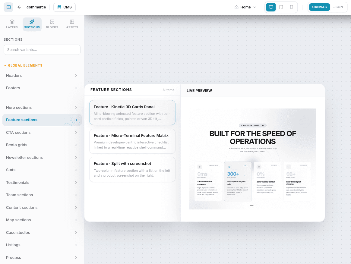
- Open the Sections tab in the Left Sidebar.
- Select a section category (e.g., Hero sections, Bento grids, CTA sections, Team sections) to view its template variants.
- Click any template card in the sidebar to instantly append it to the bottom of the page canvas.
Adding Custom / Blank Sections
You can open the Add Section modal in three ways:
- On an Empty Canvas: When editing a brand new page or after deleting the last remaining section, a large Add Section button appears in the center of the canvas. Click it to create your first section.
- On Hover (Insert Above/Below): If there are existing sections on the canvas, hover your cursor over the gap between two sections (or above the first / below the last). A floating + button appears — click it to insert a new section at that point.
- From the Layers Panel: Click the + (plus) icon next to the Main category in the Left Sidebar's Layers list at any time.
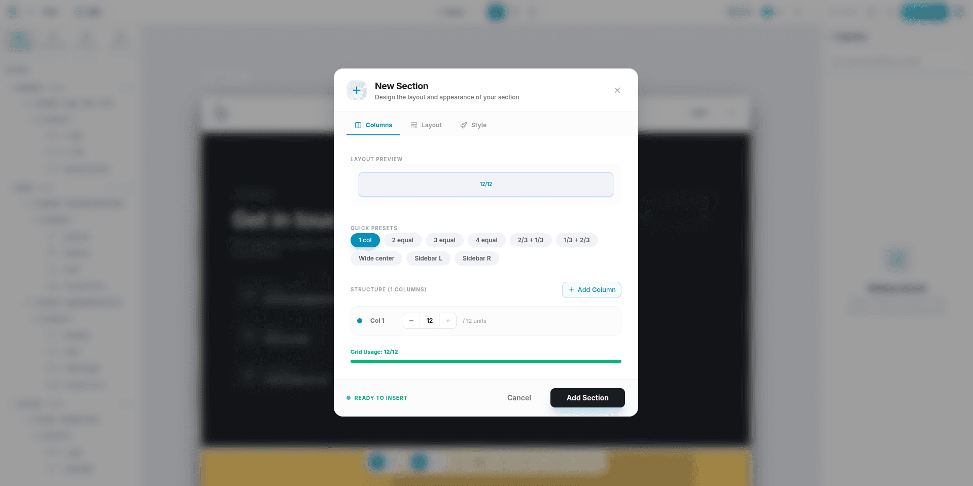
Once the Add Section modal opens, it has three tabs:
- Columns — choose a column layout preset (1-Column, 2-Columns, 3-Columns, or asymmetric splits).
- Layout — set the Column Gap, Vertical Padding, and Horizontal Padding.
- Style — pick a background color and configure a border (width, style, color, corner radius).
Click Add Section to insert the row.
Section Categories
Global Layout Sections
These appear at the top and bottom of every page across your entire website:
| Section | Description |
|---|---|
| Header | The top navigation bar, typically containing your site logo, menu links, and a call-to-action button. In the Header's Buttons settings, CTA buttons live in the mobile menu by default. Turning on Show button N on mobile moves that button next to the menu icon instead of inside the drawer — it's one placement or the other, never both. Turning on Icon only on mobile hides that compact button's label (the button must have an icon). |
| Footer | The bottom footer, housing copyright information, site maps, social media icons, and legal links. |
Editing the Header or Footer on any page updates it site-wide, since both live in one shared Layout. Publishing your Page does not push those changes live — you need to choose Layout or Site scope in the Publish dialog. See Saving & Publishing.
Page Content Sections
These represent unique sections created specifically for the active page:
| Category | Typical Layout Options |
|---|---|
| Hero | Big visual headlines, text subtitles, CTA buttons, and split column images. |
| Feature | Grid cards displaying product benefits, service items with icons, or content splits. |
| Bento | Modern asymmetric box layouts combining stats, copy, and images in a grid. |
| Stats | Large numbers, metrics, milestones, and labels. |
| Testimonial | Customer quotes, author names, avatars, and star ratings. |
| Team | Profile grids showing team photos, job titles, bio details, and social profiles. |
| Content | Multi-column long-form text articles, lists, and formatted rich text. |
| Logos | Horizontal bands showing client logos, partner brands, or media mentions. |
| FAQ | Interactive accordion lists that expand/collapse to answer customer questions. |
| Pricing | Multi-card pricing comparison tables highlighting different tiers and buttons. |
| Form | Direct integrations that display custom forms you've created in the Form Manager. |
| CTA | Focused call-to-action banners driving visitors toward a single action. |
| Newsletter | Email capture forms for growing a mailing list. |
| Case Study | Long-form breakdowns of a project or customer outcome. |
| Listing | Directory-style listings of items, locations, or entries. |
| Process | Step-by-step "how it works" walkthroughs. |
| Article | Blog- or article-style layouts for long-form content. |
| Map | Embedded location or map displays. |
| Services | Grids or lists of services you offer. |
| Menu | Restaurant- or product-menu style layouts. |
| Portfolio | Project or work showcases. |
Section Settings (Right Sidebar)
Select a section on the canvas to open its settings panel in the right sidebar.
General Settings
- Label: Change the name of the section as displayed in your Left Sidebar layers list.
- Anchor ID: A custom identifier (e.g.,
featuresorcontact-us) that enables linking directly to this section. Visitors clicking a link toyoursite.com/#featureswill be scrolled smoothly to this section. - Section Type: A dropdown to re-categorize the section's semantic layout type.
Spacing & Spans (Columns Only)
- Column Span: When selecting a column within a blank layout, use the slider to adjust its width out of a 12-column grid. For example, two equal columns will have a span of 6 each.
Size & Alignment
- Width: Choose between Full (extends edge-to-edge) or Boxed (contents are constrained inside a max-width container).
- Max Width (px): When set to Boxed, you can specify an exact pixel width limit (defaults to
1200). - Height: Configure the minimum height to Auto, Small, Medium, Large, Half Viewport, Three-Quarter Viewport, or Full Viewport (
min-h-screenon the published site — the editor canvas approximates the taller presets with fixed pixel heights to avoid layout loops inside the preview frame). - Alignment: Adjust the horizontal alignment (Left, Center, Right, Justify) and vertical alignment (Top, Middle, Bottom) of inner elements.
- Sticky Columns: Toggle this switch to lock columns inside this section in a sticky position while scrolling. Perfect for maintaining visibility of an image or text card beside a long list.
Background
- Background Color: Select a custom solid background color, or toggle the Use theme color switch to inherit your global theme's default background token.
- Background Image: On preset (template) sections, set the fit (Cover, Contain, Stretch) and an optional color overlay for text readability. On blank sections, set the size (Stretch, Cover, Contain, Auto), position, and repeat instead — there's no overlay control on blank sections.
- Gradient Backgrounds: Available on both preset and blank sections. Choose a start and end color, an optional middle color, and a direction (to-top, to-top-right, to-right, to-bottom-right, to-bottom, to-bottom-left, to-left, or to-top-left).
- Animated Backgrounds: A fourth background type, also available on both preset and blank sections — pick a motion effect, an accent color, and an intensity level.
Borders, Shadows & Spacing
- Padding & Margin: Fine-tune inner paddings and outer margins for all four sides (top, bottom, left, right) independently.
- Border Style: Define border width, style (Solid, Dashed, Dotted), color, and corner radius — there's no fixed maximum, so large values are allowed.
- Box Shadow: Fine-tune a shadow directly — horizontal and vertical offset, blur radius, spread, and color (a theme token or a custom color). There's no preset depth list; you dial in the exact look.
Effects
- Hover Effect: Apply a hover animation to the section — None, Lift + Shadow, Shadow, Scale Up, or Glow.
- Tail: Toggle a decorative tail/pointer shape on the section, with its own variant and color.
Device Visibility
Control whether this section appears on specific device screen sizes:
- Visible on Desktop: Show/hide on screens ≥ 1024px.
- Visible on Tablet: Show/hide on screens 768px – 1023px.
- Visible on Mobile: Show/hide on screens < 768px.
Reordering & Managing Sections
Header and Footer sections can't be drag-reordered, since they're fixed layout slots — but you can still right-click one to Duplicate, Move Up/Down, or remove it from the Layers panel.
- Reordering: Drag and drop layers up or down inside the Main category of the Left Sidebar Layers panel, or right-click a section on the canvas and select Move Up / Move Down.
- Duplicating: Right-click a section on the canvas and select Duplicate to clone it.
- Deleting: Click the red trash icon next to a section in the Layers panel, or right-click a section on the canvas and select Delete.
Deleting a section permanently removes all blocks nested inside it. If done accidentally, immediately use the Undo (Ctrl+Z / Cmd+Z) button to restore it.
Related
- Editor Overview — Editor layout, toolbars, and side panels.
- Blocks — Every block type you can drop into a section.
- Saving & Publishing — Publish scopes, version history, and how Header/Footer changes go live.
- Templates — Buying and unlocking additional preset section designs.